PTV: Explore the Night
Armed with cameras, teams of commuters went out and explored the night with public transport, documenting all they discovered.


Explore the Night
Developing the look-and-feel of this campaign also included an opportunity to create a design rationale: detailing the typographic process and what goes into making a lockup.

Letterforms & Typography
Born from light, part hand-written and part neon; the ‘Explore the Night’ lockup is envisioned as glowing letter-forms. The intent is for the type to appear as pure energy written in air, as if captured by a camera with long exposure.
But before the type is brought to life, the base typography and silhouette necessitates consideration.
A bold, italicised script has been chosen as a foundation for the typography. This supports the idea of air-written text, while standing strong at small sizes, large sizes, and from a distance.
The lead characters (e.g. ‘E’ in ‘Explore’, ‘N’ in ‘Night’) begin larger than their trailing characters. As each word unfolds, their characters scale in a gentle, considered perspective. This adds interest and gives the impression of type slowly fading into the atmosphere from a brief exposure.
Each line is independently angled to further emphasise the italicised letter-forms. Each word is not set to a specific, hard, mathematical angle; but instead each is visually balanced by eye, completely dependant on the positive space between characters and words.
The word ‘the’ is smaller in hierarchy. It sits between the descender of the ‘p’ in ‘Explore’ and the ascenders of ‘N’ and ‘h’ in ‘Night’. This position equalises the white space between the typography, and creates visual harmony. The ascender of the ‘h’ angles upwards into the ‘l’ above it and the ‘i’ and ‘g’ below, giving a visual angle: the impression of motion and forward momentum.
The letter-forms are subtly tweaked from character to character as necessitated. Kerning between each is considered to balance negative space, while the joiners are re-worked to evenly link. The dot of the ‘i’ is filled to give the impression of a point in the air, a flame. Where it feels right, the final characters of each word have an extended swoosh at the finial, a flick into the air.
Type Treatment
Once the lockup’s typography has been finalised and the silhouette visually balanced, the glow treatment is ready to be crafted. The ultimate goal is for the type to appear less neon, more hand-drawn in the sky. The colour palette bleeds white, to yellow, to deep orange.
Variable transparency is a strong way to bring the words to life, especially when sitting over night-time imagery. At the centre and middle of each letterform, the light thins, allowing the background to slightly show through. Soft dust motes are scattered throughout, for texture and a touch of magical night energy.

As each letter-form rounds a corner or tapers to an end, the glow strengthens, brighter and whiter. This variation breaks up the typography and gives the impression of a longer exposure in those areas, with light bunching up, lingering.
The typography has a deep glow to it. Brighter areas burn white hot: while edges glow out into a crispy, deeper yellow. There is a clear edge to the type, but it has a subtle, soft edge before fading into an extended glow.
A warm yellow glow extends beyond the boundaries of the type. Behind this, a deep red radiates out: beginning small in the centre but stretching longer, beyond the lockup edges.
A red-shift is worked into the extremities and in extended space behind the forms. Yellow gives way to warmer reds, particularly on the top and bottom halves of each line. This adds contrast and visual interest, a depth of colour, avoiding a flat look.
White-hot touches help pick out key areas of type, leading the eye over the lockup as a whole.


Tram Wrap
I also adapted the artwork to run across a tram. Here, the Explore the Night lockup is larger than life, anchoring every element to it from a distance. As the tram approaches, the story of time and location are the next details seen.


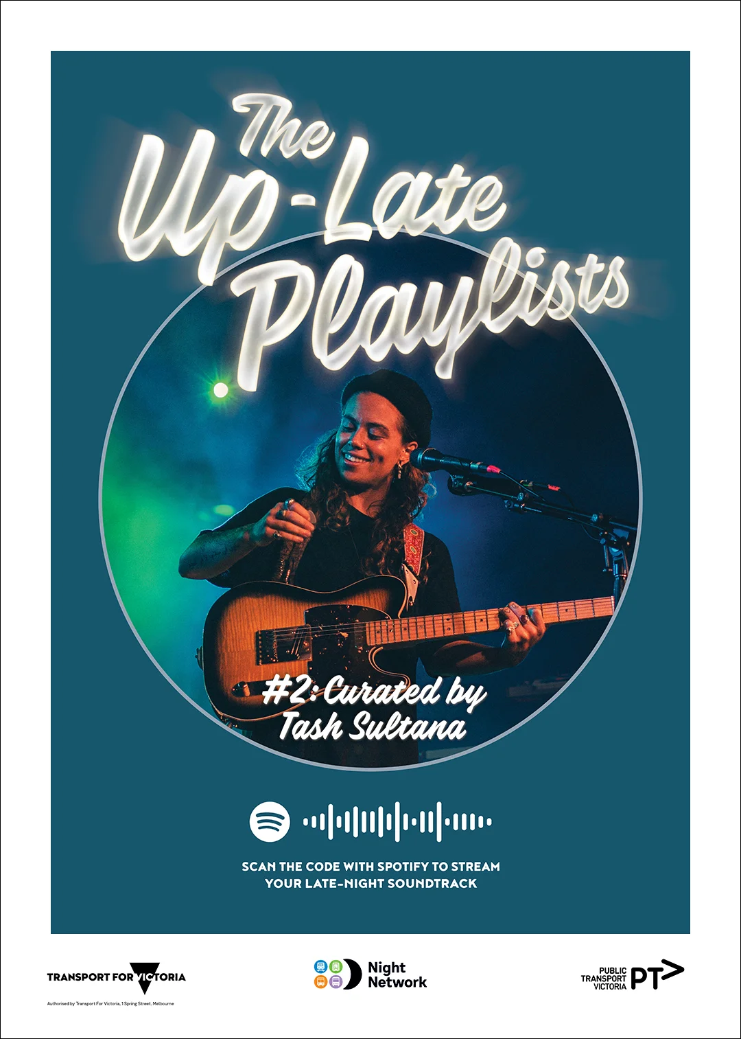
The Up-Late Playlists
A series of eight posters. You can scan the waveform on any poster with the Spotify app, and have an awesome soundtrack for your night out.