


Ticketing system myki can offer discounted passes for employees. I crafted this DM piece to get employers in the know.
The brief: throw a train on a money tin, stick a letter inside with a bunch of bullet points, and send it out.
But hold on! We can do better.
I got crafting.
My research led me from piggy banks back to the old tin-plate toys and trains of the 40’s & 50’s. Stylised line art, limited colour palettes, halftones. A little texture.
Here’s a poster of the final tin. I kept it representative of a Metro train, but simplified where it mattered. Light and dark linework are offset to give the illusion of depth, just as tinplate artwork was in days gone past. Large areas such as windows and wheels were embossed out of the tinplate.
I worked subtle texture and chromatic aberration into the poster. Just a little touch.
I’ve never been a fan of bullet points.
Or bland letters.
So, when tasked to make a bullet point factual letter to go into the tin, I believed there was another way. But the art directors in the agency were all slammed with other work.
So I had a crack at it.
What if the letter—wasn’t a letter? What if the bullet point facts—weren’t bullet points?
I’d already established a mid-century tinplate direction for the tin. So, I turned the facts letter into fact cards.
Taking cues from retro board games and tinplate model houses, I turned each fact into a tile of road or rail which could be linked together into a little layout.
The cards are packed inside the tin, each stating a fact about myki Commuter Club.
We still needed an introduction letter. I laid it out simply, with the same typography and visual direction as the cards. It sits on top of the cards in the tin, and is the first thing each employer sees when they open it.
On the flip side of the letter is a railway station. I illustrated the artwork to scale, so it can sit in-layout next to the track pieces.
This DM piece could have been a stale throwaway.
Instead, I’ve created a highly visual DM piece which is fun, tangible and interactive. It piqued curiosity (and employer sign-ups)!
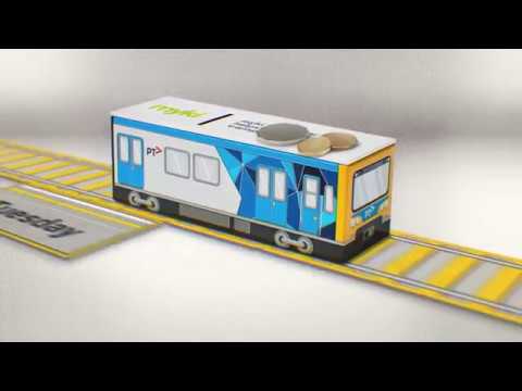
In my spare time I had a go animating the train. We ended up using it in office lobbies, venues and on LinkedIn.
This project combined conceptual design, art direction, illustration, video work and lots and lots of hands-on mocking up. Also my first ever client meeting.
This project let me push myself in new ways.
I look forward to growing and learning more in the coming years!
I didn’t end up using this illustration but it helped getting into the tone.